As we all know, the market puked in April due to the new administration’s tariff announcement but has recovered mightily since – a big, beautiful rollercoaster, you might say.
During the recent rally, not all names have performed the same way nor do they share the same outlook today. Let’s apply our style of chart analysis to see where some of the most popular stocks stand today.
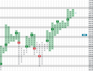
Berkshire Hathaway – BRK B
Warren’s baby certainly could be categorized as a value investing name. For such stocks, the reaction to the drawdown and rebound was very different what we saw from the growth camp. In fact, during the market tanking in April, Berkshire actually reached an all-time high! It has since made a second attempt to breach the important resistance at $536 (which it would be by virtue of a print at $544 due to our expanded box sizes for higher-priced stocks). However, May and June so far have seen a return of growth stocks to the front burner status.
Meanwhile, BRK has eased off to $488 as a value stock that has suffered vs. growth. Still, it’s rise has been quite orderly. Holders can hold while those thinking about nibbling can consider the recent pullback as a nice 10+% discount for their patience.
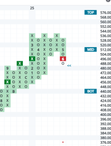
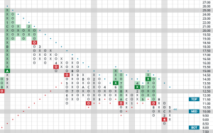
J.P. Morgan – JPM
Financials remain in favored status for us as a sector, although we tend to hold more fintech names in our portfolios as opposed to big banks. However, the big well-known financials tend to be widely held so here’s an update on one.
JPM reached an all-time high in February at $280.25. The short-lived downdraft took it to exactly the bottom of its trading band – $204. The rollercoaster then reversed and after a breakout at $$240, it has its sights on the February high.
Currently sitting at $268, the beauty here is in the eye of the beholder. Short-term traders who bought the pullback might note that it is getting a bit extended and profits should be taken. Long-term holders might take comfort in the fact the stock hasn’t extended to the top of its trading band so they’ll stick with it. Both positions are rational enough.
For us, sometimes no opinion is an opinion. We’re on the sidelines here, with the most favorable component we can see being the positive status of the sector itself.
Walt Disney – DIS
Here’s another example of a stock bottoming near the bottom of its trading band during the big market selloff. An explanation of what these trading bands represent: they are one standard deviation from the current price based on the stock’s beta. I find them helpful when I’m looking to initiate positions (near the bottom of the band) and when I’m looking to lighten up on a position (at the top of the trading band). While I adhere to no hard and fast rules and prefer to remain flexible, the technical wight of the evidence suggests to factor the bands into account for one’s trading strategy.
In this case, the stock is extraordinarily extended on a short-term basis, thus traders looking to take a little money off the table are thinking straight in our view.
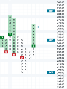
Spotify – SPOT
I wouldn’t say this is a widely held stock other than for growth investors. It does highlight, however, the strong rebound in growth since liberation day. It had quite an orderly retreat from its pre-liberation high print of $640, declining twice to near the trading band bottom near $480. As the coaster headed uphill, SPOT participated meaningfully breaking many tops on its way to another all-time high.
A very meaningful break is lined up at $720, which would form a bullish catapult (a triple-top breakout followed by a double-top breakout). Is there any upside left after the move we’ve already seen? Likely, all the way up to $792 if that catapult gets completed.
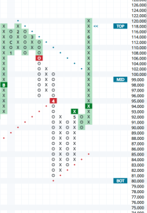
Ford – F
Industrials and Autos have low totem pole rankings on our favored sectors list at the moment. Still, we do get asked quite often, “What about Ford, it’s got a 7% dividend yield?” To us, the 3-year chart says it all. We would ask the question on what feels worse, a 65% decline in the stock price or collecting 7% in dividends for the last 3 years? With nothing positive to note from a chart perspective, Ford remains one to avoid in our view.
Hopefully, this post is interesting and useful to holders of these names — or to those investors who might be considering them.