Point & Figure charting offers a unique perspective on stock price movements, focusing purely on price changes rather than the passage of time.
You’ll notice columns of Xs representing rising prices and columns of Os indicating declining prices, but no months at the bottom of the chart to denote time – only years.
This is where those numbers and letters you’ll see come into play. They’re actually how Point & Figure charts subtly weave in the element of time.
Unlike traditional candlestick or bar charts with a horizontal time axis, Point & Figure uses these alphanumeric characters to mark the passage of calendar months. This helps analysts see how long a particular price trend has been in play.
Here’s the breakdown:
- Numbers 1 through 9 are used to denote the months of January through September. So, if you see a ‘3’ in a column of X’s, it represents where the month of March began in that upward price movement. Similarly, an ‘8’ in a column of O’s signifies the start of August in that downtrend.
- For the final quarter of the year, letters are used:
- A represents October.
- B represents November.
- C represents December.
It’s important to understand that these time markers don’t appear with every single X or O column. In a slow-moving chart, you could see multiple months in the same column, while multiple X/O column reversals can happen between months in more volatile names. This way, you can track when each new month began within the price action.
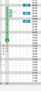
Example of a slow-moving chart (T):
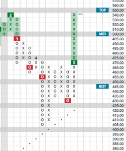
A faster, more volatile chart (QQQ):
While Point & Figure’s primary focus remains on price, these numbers and letters provide valuable context. They allow you to see not just the direction of price movement, but also its duration within a specific timeframe. This can be helpful in understanding the momentum and potential staying power of a trend. So, the next time you see a number or letter on a Point & Figure chart, remember it’s a subtle nod to the passage of time within this unique analytical framework!