The debt ceiling battle. Worrisome consumer spending. Surprisingly persistent inflation. Interest rates. Possible recession.
There are plenty of reasons to be worried right now and, as a result, to take a negative position toward the stock market.
One of the reasons we lean heavily on technical analysis, however, is that it is a humble approach to investing: it says that in an attempt to understand the supply and demand balance in the stock market, the collective wisdom of investors can be gleaned. In other words, the market as a whole is, generally speaking and over long periods, more wise than any individual investor.
Indeed, none of the worrying conditions I listed at the top of this post is a secret; market participants are well aware of these reasons for worry and have likely already baked them into prices.
So I thought it was time for some high-level review. Following our open, direct call to investors to start buying in October, it felt like time to examine where the market’s field position stands today.
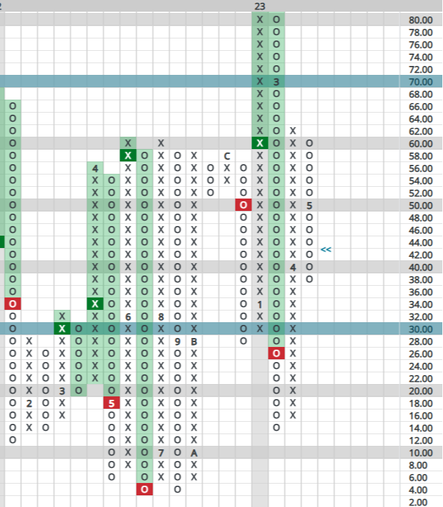
Before looking at the charts below, a few brief reminders: X’s represent rising columns, O’s declining. Numbers within those charts represent months (1-9 for Jan-Sep, A-C for Sep-Dec). In that post from last fall, I focused on one indicator, the HiLo, as an example of how uniquely oversold the market was at that time. Today, however, we will look at a handful of charts to get a sense of where things stand.
Intermediate-Term Indicators
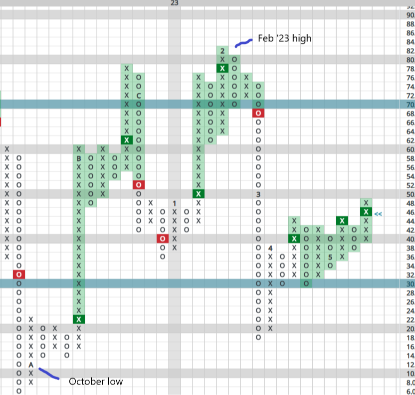
The broadest measure we look at is called the NYSE Bullish %. which simply measures the percentage of NYSE stocks in positive trends (on Point & Figure “buy” signals). This gauge typically lives in a range between 30-70%, with readings above or below those figures suggesting extremely overbought or oversold conditions.
As can be seen below, the Bullish % swung more wildly and rapidly than usual — a reflection of the spring selloff, the short but powerful bear market rally, then the subsequent plunge that resulted in the October low.
This year started with what seemed to be more wild volatility: a powerful rally into February that saw the Bullish % swing from an extremely oversold reading below 20% to nearly the overbought 70% level. The March selloff was quick, powerful and took us down near that oversold 30% reading yet again — all of this equating to unusual whipsaw action for an indicator that is usually slower to reach either extreme.
What is most intersting, however, is that the modest rally we’ve seen over the last 60 days has not taken us back to overbought levels. Indeed, the Bullish % seems to be slowing down to what seems to be a more normal pace. Yes, we’re in a declining column suggesting some caution is in order, but we’re starting to suspect the lows we saw in October may have been a long-term low, that the gains since might be more lasting than just another bear market rally.
But let’s look quickly at a few more indicators.
Next up is the Sector Bell Curve. As with stocks more broadly, we can analyze sectors and determine the percentage of stocks within each that are on P&F buy signals. To get a wonderful supply/demand view of the market, we then simply plot each of those sectors on a bell curve. Again, these generally live on a “field” between the 30% and 70% yard lines, but more extreme readings can develop just as they did last October:
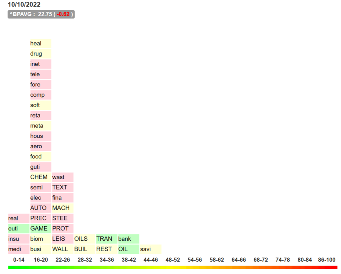
As can be seen, most sectors were stacked well below that oversold 30% level, meaning supply had already been exhausted and it wouldn’t take much to ignite a powerful rally. Also noteworthy is that some of the stocks that were the least oversold, like banks and energy, have been laggards since. It has been the grossly oversold sectors that have led since the fall.
So, where do things stand with that same Sector Bell Curve today? In a pretty normal distribution, actually:
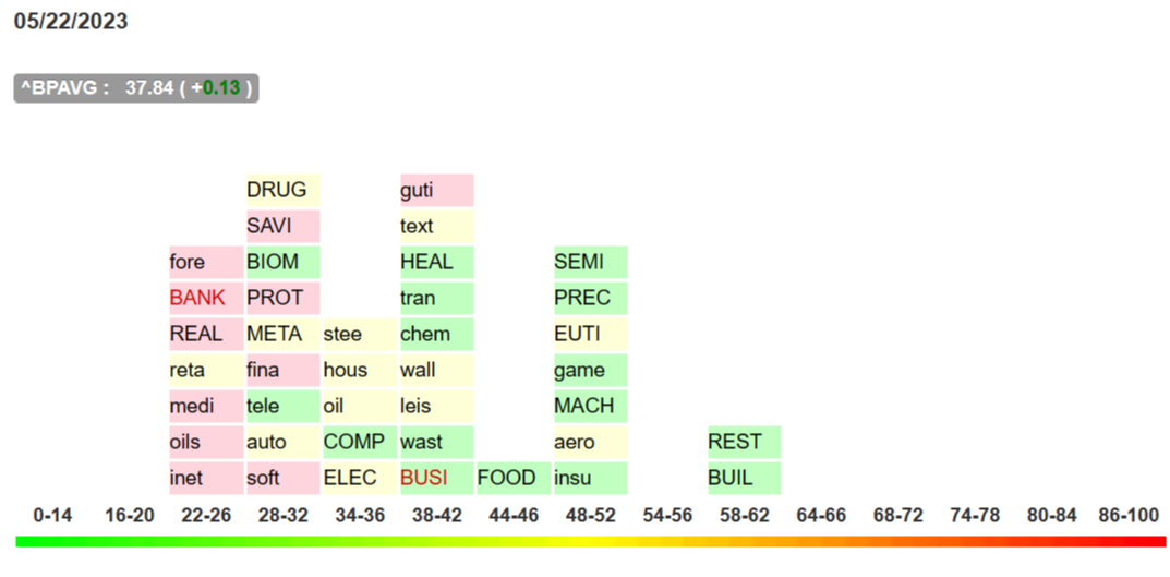
Or, put another way: the market has not swung back to worrisome oversold levels during thiis rally.
Now, for a couple of quick shorter-term views for confirmation…
Short-Term Indicators
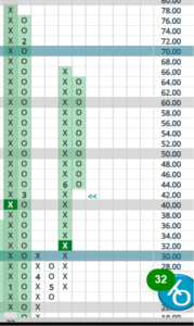
One simple indicator I like is the percentage of stocks above their own 10-week (50 day) average. This indicator is supposed to move quickly and can routinely reach extreme levels in the teens for lows and above 80 for highs. Indeed, the October low and February peak are well marked:
…but what’s interesting is that the rally from the March lows has not taken us anywhere near overbought levels, seeming to confirm what we’re seeing in the slower-moving Bullish % indicator I wrote about above.
Finally, back to the one I wrote about in October: the HiLo, which measures the percentage of stocks making 52-week highs versus those making 52-week lows. Yet another short-term indicator prone to reach extreme levels, the October bottom and Feb peaks are again easy to see:
…and just like the other indicators, this one is not flashing a need for extreme caution at present. Yes, we’re in a declining column but the HiLo is closer to oversold levels than overbought.
Amazingly, there appears to be less risk today in the stock market than there was just 3 months ago. Given all of today’s fundamental reasons to worry, that probably strikes most investors as surprising.
…which is also why it intrigues us.
What does this all mean for investors strategically deploying capital for the 2nd half of the year?
We do still have to admit that some big moves have been seen over the last 8 months, gains that investors may want to protect.
For those sitting on winners, it is fair to consider trimming positions you may hold in strong sectors, such as Semiconductors, Healthcare, Biotech, Restaurants and Building. Because these sectors have not broken down technically, we could see continued strength. That said, taking partial profits from October’s bottom makes sense, particularly if you’re holding some of the wildest winners.
Just look at META, for example: this stock has launched from a low near $90 in October to nearly $250 today! Should investors consider taking partial positions off the table after such a run? That certainly sounds reasonable to us.
How about those with new capital to invest? Because our indicators are mixed, and some important, longer-term gauges are in negative columns, we don’t recommend deploying new capital wholesale at present. Just as those looking to trim winners, those looking to do some buying can do so slowly at present, picking up only partial positions in select sectors now while waiting for a clearer picture to emerge. That said, some buying can take place because overall, the market is not near overbought conditions that should be considered too worrisome.
We’re past earnings season so stocks could lack direction for a while. And while the debt ceiling issue should soon fade, it will continue acting as both a drag and a catalyst, depending on the day’s headlines.
In the end, while we see little cause for alarm in the market’s technical picture overall, that picture is not nearly as clear today as it was at the October lows. Sometimes that is simply the case.