Despite the commentary and occasional explainers, even regular readers probably have a hard time making heads or tails from the Point & Figure charts we include in many of our posts.
What, exactly, are we trying to do with these funny-looking graphs that don’t look anything like “regular” stock charts?
Supply and demand.
The Point & Figure methodology is a little-known method – increasingly unknown, actually, since most of the financial advisors being churned out today are asset gatherers who, by design, know almost nothing about individual stocks – created well over 100 years ago by Charles Dow. It filters out the noise of small fluctuations and creates reliable, repeated patterns that can help discern whether buyers or sellers are in control. We realize they do take a lot of getting used to and years to fully comprehend, which we frankly believe defines part of our unique value to investors.
Speaking of noise, a lot of it has come this week from Intel (INTC), which has woken up a bit thanks to comments from the new Vice President, J.D. Vance.
Down more than 50% percent this year and with a market cap beneath $100 billion, which makes it a peanut compared to its former peers, is Intel a great bottom-fish opportunity at the moment?
Maybe, but our approach demands more. A brief explainer follows via a P&F chart that has another interesting element to it*:
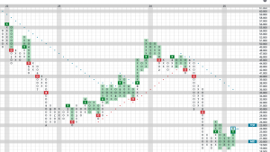
In this 3-year chart, the brutal slog for investors is clearly visible but there is one noticeable bright spot: the declining column of O’s has held four times since last August (numbers in the charts represent months, with A-C representing Q4 months) at $19.
Another small positive: the latest rising column of X’s has exceeded the prior rising column of X’s, marking a double-top break, which is good.
That said, more evidence of demand control would be needed. For instance, a break above that other recent column of X’s at $27. However, if this occured right away, it would take INTC above its expected short-term trading range. Were such a spurt higher to occur quickly, we would expect a pullback that would need to work off that short-term overbought condition.
My preference would be for a pullback into O’s first, hold above $19 yet again, then a reversal up that exceeds this latest column of X’s. That would provide additional evidence that demand is truly in control.
My preferred outcome would result in what is often called “backing and filling,” which in this case would happen in the low 20’s.
What isn’t pictured above is relative strength, however, both of INTC vs. the market and vs. other names it its own semiconductor sector. For now, it remains negative on both counts, which is important to us. Additionally, it remains well below the dotted downtrend line you see, which is actually a helpful tool and also suggests that more time is needed before INTC will be a reliable turnaround play.
For now, this stock is at best categorized as an aggressive bottom fish by those hoping for a fundamental turnaround. Buyers would be well advised to place stops just below that $19 level, as a breach of that support would be an awful sign that supply is not yet in fact exhausted.
*Note: another interesting element of this chart is on the right-hand column of prices. Note that below $20, the box size changes to $.50. Why? In P&F analysis, we only change stocks from X’s to O’s when there has been a “3-box reversal” from one to the other, which helps filter out the noise of smaller moves.
Above $100, the box size changes to $2 (and very high priced stocks can have even larger box sizes) but below $20, we contract it to reflect the larger percentage impact of just a half-point move.