Today I was talking with an investor who asked, “Is there ever a situation that arises where the chart looks so bearish it’s actually bullish?”
Yes, typically around tax loss selling into the January bounce. We do occasionally employ this strategy in our portfolios. You should strictly view this as a trade, however. Think about it from this perspective: washed out stock XYZ ranks at the bottom of the Technical Attribute scale….by definition. The dead cat bounces it experiences will do nothing to change that ranking due to the extreme short-term nature of that bounce off the pavement. It would take a sustained movement, plu typically some action akin to backing and filling, to move it up the rank of attributes.
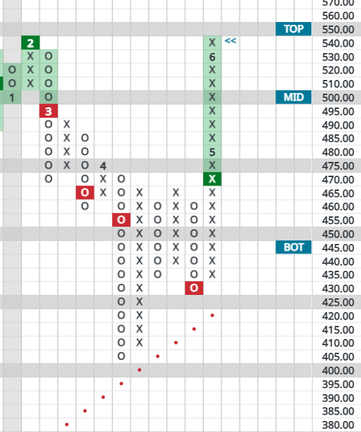
Currently natural gas may be considered washed out and due for a dead cat bounce. Peaking at $3.60 in October of 2023, it now sits at $1.90, about cut in half but slightly off February’s 2024 bottom of $1.60. There is a seasonal component to nat gas pricing, peaking in the August to October period in anticipation of winter heating demand. This pattern has continued in the past 12 months.
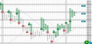
In Point and Figure methodology, there is a quirky little rule. When a stock exhibits a column of 13 to 17 X’s (illustrating rising prices), or O’s (signifying declining prices), that’s about the extent of the move. The next move should be a counter move… and thus the dead cat bounce. Nat gas saw a 12 box decline on its .10-point chart, which for my taste is close enough. The most recent action may be the start of backing and filling, possibly a prelude to its seasonal rise in late summer.

Stay tuned.
Other market sectors to look for dead cats at present? Try retail and healthcare.


